
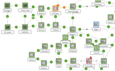
Map
The network monitoring map is displayed in all tabs except the ‘Overview’ tab. It shows the network elements and the sections according to their aggregated performance state and validity. See example in the screenshot below.
• The performance state defines the color:
Ok = green,
Fair = blue,
Poor = orange,
Bad = red,
Unmonitored, Unavailable = white.
• The validity defines the pattern:
Current = solid,
Outdated = striped/dashed,
No Data = empty.
Under ‘View Options’ in the top right corner of the map you can also enable alarm coloring. In this case, the colors indicating performance state are overlaid with the colors indicating alarm severity.
You can click on an NE or a section on the map to see the details on the right panel. You get the same view when you are in tab ‘Section’ or ‘NE’ and select the entity in the left panel. See the detailed description of the tabs in the sections below.