
Details Panel (Right Panel) + Details Navigation Bar
The role of the details panel is to provide an immediate summary of a group of objects or a single object, with the possibility to conduct a more detailed examination. It allows to check and verify entities from perspective of different use-cases, and it often acts as a supplement to the entities list and visualization.
The details panel has the following roles in the system:
• Providing statistical summary of all entities within given context
• Providing summary of key information describing entities
• Allowing management of detailed visibility of entities on the map
• Acting as an entry point to executing actions.
The details panel functions in combination with details navigation bar and its behavior is strictly connected to the user’s interactions with the entity browser or the map.
In general, we have three main details panel types:
• Application Summary
• Single Entity Details
• Multiple Entities Details
The type of details panel visible at given moment depends on the selection or the mode.
The details panel has a default mode – preview. Preview mode dynamically reacts to the users’ selections: when the user selects entity or entities from the entity browser or from the map, the details panel changes to present the details of currently the currently selected single entity or multiple entities. When the entities are being unselected, the details panel gets back to its basic form presenting the application summary.
The user has also the possibility to “pin” various details panels. Pinning allows the user to easily access the detail panels later for given entities without a need to traverse through the entity browser.
All pinned elements are represented by tiles with the entity type symbol in the details navigation bar. Users can freely jump between them and the preview mode (indicated by the tile with eye icon) by clicking given tile. When a pinned element is active in the details panel, selection in the entity browser or on the map does not affect it. To get back to the situation when the details panel follows the entity panel or the map, the user needs to select the preview tile in details navigation bar.
The details panel itself is collapsible depending on the needs. To collapse or expand the details panel the user needs to click the collapse / expand button placed at the top of the details navigation bar.
The details panel is composed of following elements:
• Header – acting as a title to the details panel. When entity is selected, apart from the name, key status information and type of entity is presented. Moreover, the “pin” icon, that allows pinning or unpinning of the element, is visible.
• Action Bar – visible only when something is selected – presenting set of actions (in the dropdown button) that can be performed related to the selected entity.
• Body – space where the details are presented. The body can have its own navigation (in form of dropdown menu or tabs), that allows to present details regarding the selected entities from various categories.
Detailed Explanation of different type of Details Panels:
Application Summary – is visible in idle state of Details Panel (when nothing is selected in the entity browser or on the map). In the header, title of the panel is visible. Action bar is unavailable, instead info message is presented. In the body different type of charts are presented. The charts are related to particular tab selected in the app navigation (in the header) and therefore to the content of entities panel. These charts can present distribution of different configurational parameters between entities in the application or summary of their operational statuses.
Single Entity Details – visible when something is selected. The body can have different structure and navigation depending on the selected entity type. Common views (tabs) are:
• Summary, the default view – presenting KPIs and basic details regarding the entity.
• Configuration – presenting extended lists of configuration parameters
• “Related” - having dual function, not only it presents lists of entities that are used by selected entity (e.g. list of all network elements, sections, tunnels and PWs that are building particular Service) or list of entities that are using selected entity (e.g. list of services, pseudowires, tunnels using particular network elements), but it also allows to control visibility of these elements on the map. By interacting with checkboxes, the user can turn on and off visibility of related elements on the map (e.g., turn off visibility of some pseudowires or turn on visibility of some tunnels in selected service). Visibility in “Related” tab in Details Panel is combined with global view options from ribbon. Changing options there affect options here and vice versa.
Multiple Entities Details – visible when multiple entities of similar type are selected. In the header information about number of entities selected is presented; below the list of selected entities is visible. The user has also action to deselect all entities available.
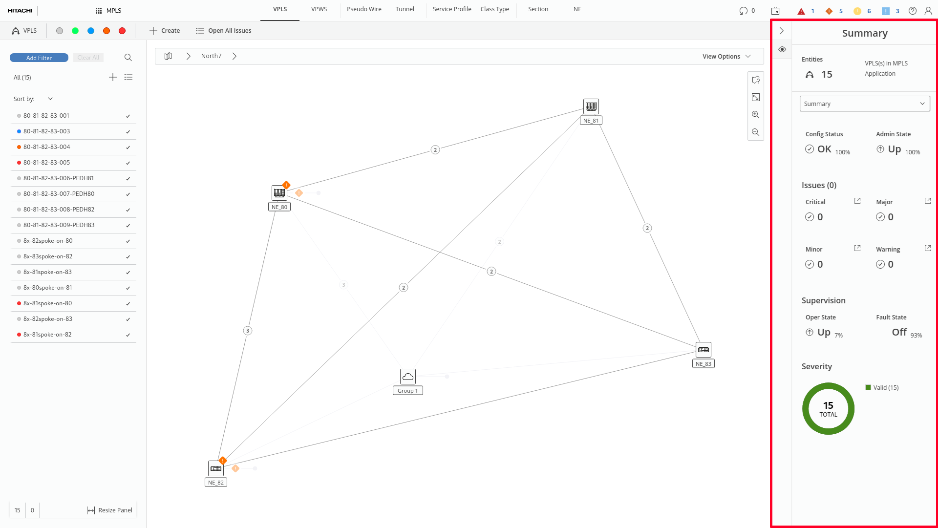
Details Panel placement (marked red)
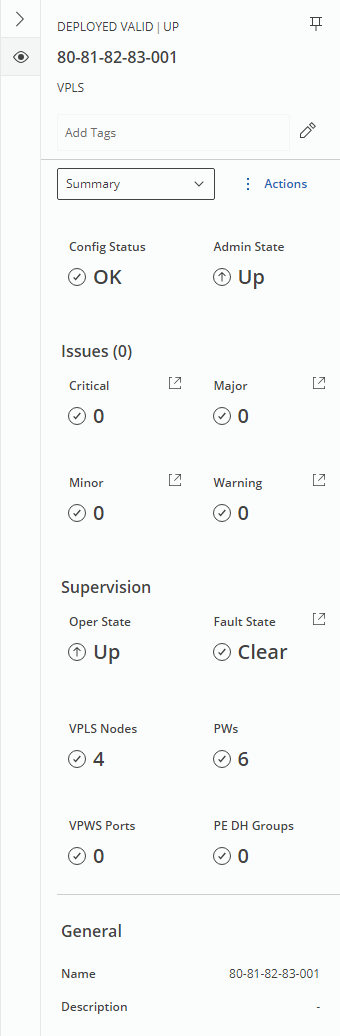
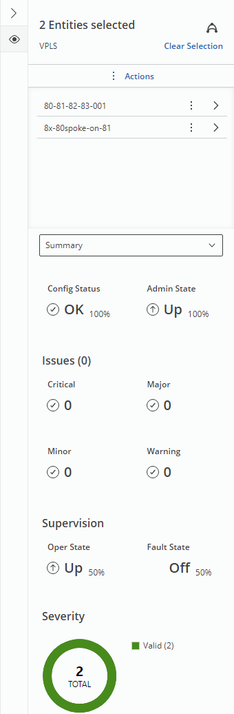
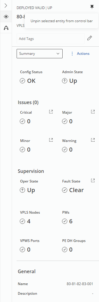
Left: Single VPLS Details Panel; Center: Multiple entities Details Panel; Right: Pinned entity Details Panel (pin state indicated in Details Navigation Bar)
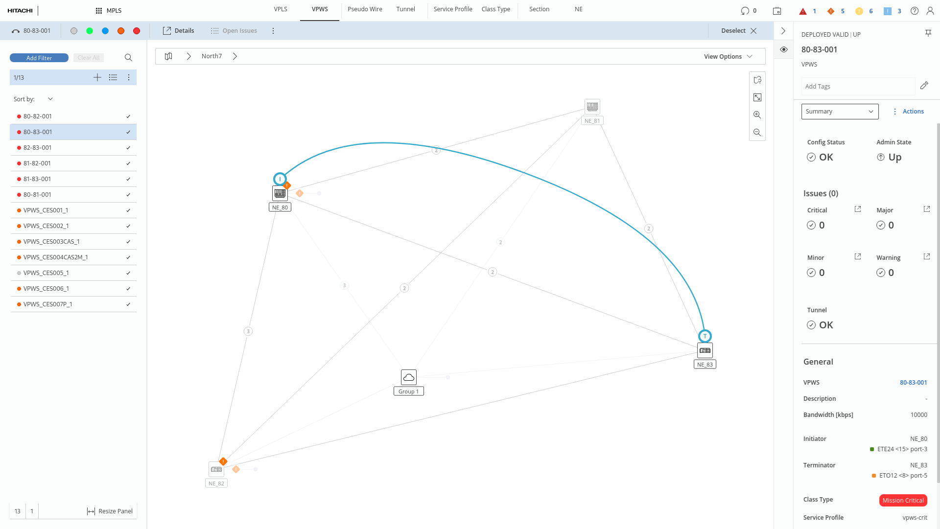
Details Panel in VPWS tab