
Entity Browser (Left Panel)
The entity browser is a component listing different objects from the network. Its content depends on the application and selected tab – it presents entities from a particular entity type. It shows only entities important for a given application.
Through the entity browser, users can select different objects – visualizing them on the map and opening their details in the details panel (Right Panel).
The entity browser has 3 different layouts that can be changed by dragging the edge of the panel.
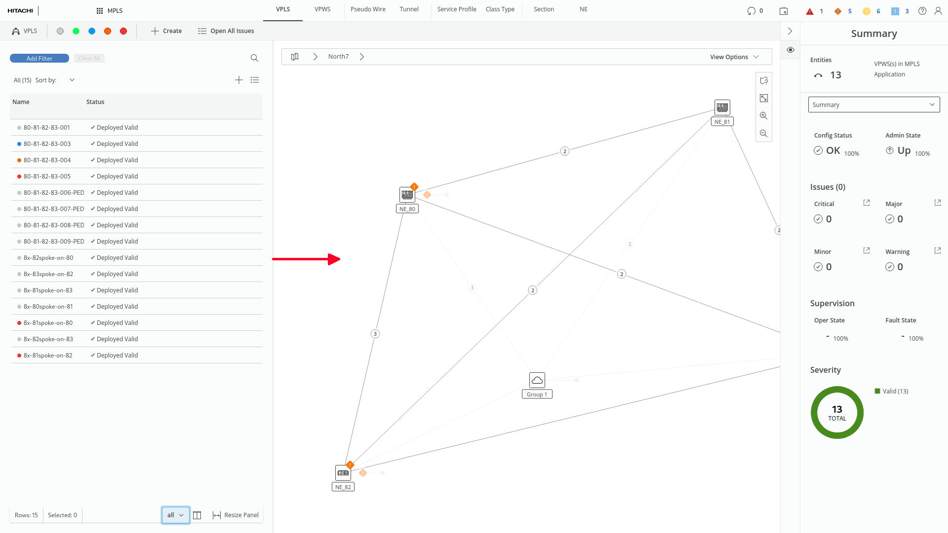
Opening entity mode by dragging action (marked red)
Different layouts include:
• Small – providing the minimum required information in the tables and taking up as little space as possible; this view mode is dedicated mostly for interactions with the map and other elements of layout.
• Medium – providing more detailed information (more columns visible), enabling the user to get a better overview of the configuration but keeping the possibility to interact with the map.
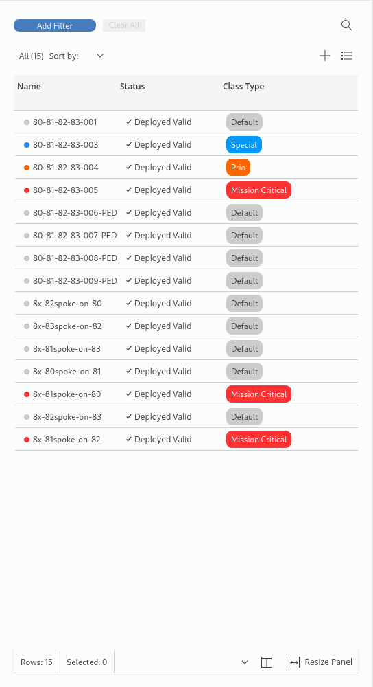
• Big – providing the full set of information; dedicated mostly for analytical use cases when there is a need to see as many details as possible.
The entity browser is composed out of following elements:
• Table Control bar – with filtering options and search for controlling content of the table beneath.
• Table – listing entities of given type in the form of data grid; with action bar and summary bar
Entity browser in full screen (marked red)
Detailed explanation of the entity browser elements and their behavior:
1 Filtering – the user can add multiple filters that affect the entities list below. To add a filter, the user needs to press the “add filter” button, in the popping panel, define filters’ category and in following view define filtering parameters. The user confirms the applying filters by clicking apply. After applying filter, a badge describing applied filter category and parameters should be visible in the row below. To remove a particular filter, the user can click the “remove” button (displayed in form of an icon). To remove all filters, the user can click “clear all” button presented next to the “add filter” button.
2 Search – the user can search for a particular entity or configuration parameter in the entities list below. Clicking the search icon (in the small panel’s version) or search input, the user can write down phrase that triggers the entities list to be filtered down to present only rows containing searching phrase. Search component has additional options to define if search results should match exactly the whole searched phrase (matches all) or part of it (matches some)
3 Action Bar – the user can perform different operations. The action bar has two states: default (when nothing is selected) and selected (when an entity from the list below is selected). The selected state is indicated by the blue background of the whole action bar and selected state of the checkbox within it. Action bar has different form depending on the size of the panel, but it always contains:
− A numerical summary of the list (how many entities are there in the list or how many entities are currently selected) with the possibility to select all of them (by checkbox).
− Sorting dropdown (present in action bar in medium and large Entities Panel view mode) that allows to sort entities below by different category.
− Actions; when nothing is selected general actions are available (e.g., create new); when entities are selected – actions related to selected entity are available (e.g., edit / delete).
4 Table Header – states the names of the columns in the table. Clicking on the wanted cell enables sorting the table by it. Sorting by table header cells and by sorting dropdown in action bar are interdependent – applying sorting through header cell changes the category in sorting dropdown and vice-versa.
5 Rows and Indicator – every row contains information regarding different entity. Every row can have a small, vertical indicator at its left side. The indicator presents that particular entity can have undesirable operational or configurational state or the alarm. Rows have two states: default, when not is selected, and selected – indicated by blue background when particular entity has been selected.
6 Summary Bar – the element below the entities list where the options on how to manage the table’s display are presented. Summary bar contains:
− Tables summary – presenting how many entities from the total number of entities in the network are visible now in the table (gives information how many entities meet filtering definition out of total number of entities of given type in the network)
− Quick “selected” filter – stating the total number of currently selected items in the table and allowing to turn off visibility of the items not selected in the table. Quick “selected” filter button acts as a toggle that can be turned on and off depending on the needs.
− Table content presets – which allow the user to quickly change the content of the table by turning on and off the visibility of columns. Table content presets allow the user to quickly adapt the information visible in the column to specific use cases (e.g., I want to see only general information about entities; I want to see all parameters regarding entities; I want to see only statistics and utilization of entities). In small view mode of the Entities Panel, table content presets are hidden under settings icons, in medium and large view mode all presets are listed. Table content presets have direct influence on the Table Column Visibility component.
− Table Column Visibility – allowing the user to turn on/off visibility of any given column.
− View mode selector – allowing the user to change view mode of the Entities Panel (to small, medium, or large):
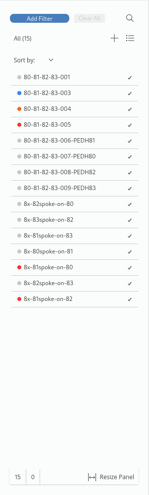
Left: Entity browser in medium size; Right: Entity Browser in small size